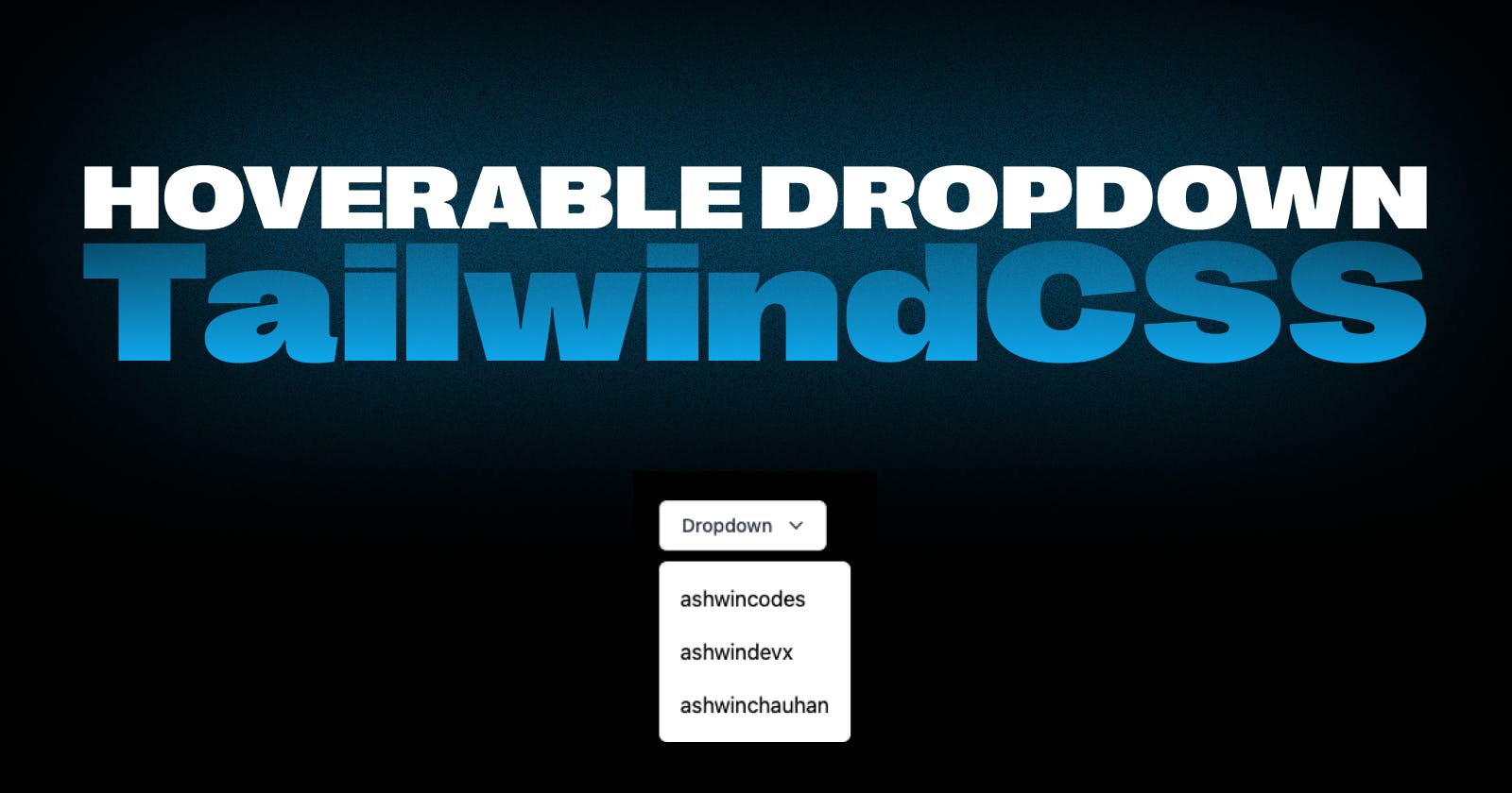
Effortless Hoverable Dropdowns with Tailwind CSS
The Two-Class Trick for Creating Hoverable Dropdowns with Tailwind CSS


A hoverable dropdown is a neat and subtle design element that helps in a number of places on your website but is most specifically used in the navbar.
When your navbar has tons of links that need to be shown. A hoverable dropdown is a saver in such a case. It streamlines your navbar and fits a lot of content into a small space without overcrowding it.
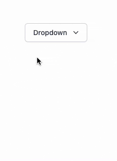
In this blog we will be implementing this:
Quick story:
I needed to create a hoverable dropdown in the navbar cause of tons of links that needed to be there. For styling the website I choose TailwindCSS. Instead of going to TailwindCSS docs to see how it can be implemented, I googled the internet and found no exact solution instead I found tons of workaround that required 3rd party libraries (which seemed a bit messy for such a small yet powerful UI element).
Those who have used TailwindCSS know it is a little tricky while working with conditional styling. Back to TailwindCSS docs, I found Styling based on the parent state section that covers exactly what we are here for.
Styling based on the parent state section states that you can change the styling of children based on the state of some parent element(Hoverable Link), marking the parent element with group class and using group-hover to style the target element in our case children(Dropdown Links container).
Let’s see the above theory with the example:
<!-- Parent element -->
<div class="group mx-auto mt-20 ml-20 w-fit">
  <p class="inline-flex w-fit cursor-pointer justify-center rounded-md border border-gray-300 bg-white px-4 py-2 text-sm font-medium text-gray-700 shadow-sm hover:bg-gray-50">
    Dropdown
    <!-- Heroicon name: mini/chevron-down -->
    <svg class="-mr-1 ml-2 h-5 w-5" xmlns="http://www.w3.org/2000/svg" viewBox="0 0 20 20" fill="currentColor" aria-hidden="true">
      <path fill-rule="evenodd" d="M5.23 7.21a.75.75 0 011.06.02L10 11.168l3.71-3.938a.75.75 0 111.08 1.04l-4.25 4.5a.75.75 0 01-1.08 0l-4.25-4.5a.75.75 0 01.02-1.06z" clip-rule="evenodd" />
    </svg>
  </p>
<!-- Child element -->
  <div class="group-hover:block mt-2 hidden w-fit rounded-md bg-white py-2 shadow-lg ring-1 ring-black ring-opacity-5">
    <a href="#" class="block px-4 py-2 hover:bg-gray-50">ashwincodes</a>
    <a href="#" class="block px-4 py-2 hover:bg-gray-50">ashwindevx</a>
    <a href="#" class="block px-4 py-2 hover:bg-gray-50">ashwinchauhan</a>
  </div>
</div>
We can see the parent div is given a class group and the child div is given a class group-hover:block here block lets the element be visible when the parent is being hovered.
Final Result:
It is pretty amazing how just adding two classes does our job instead of writing javascript or custom classes.